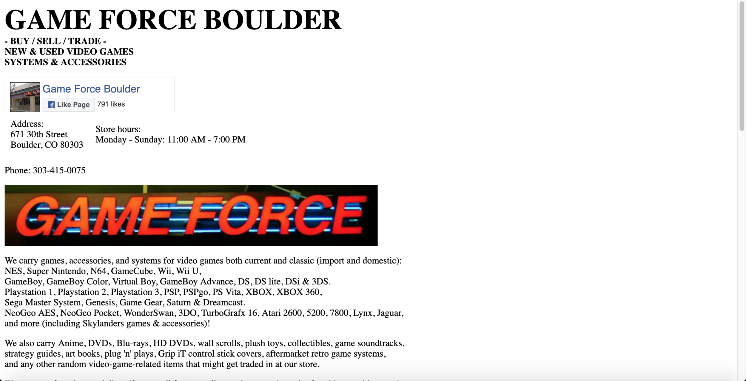
My final project for the Universal Design for Digital Media class required us to take any website and redesign it not only to look better, but to make it fully accessible to those who have any disabilities or physical impairments. As you can see, the original website is just one hand-coded page thrown together by the owner that serves as a “road sign” according to the owner. My goal was to improve the look of the page first of all, and then to add sub pages that go a little bit more in depth into what Game Force offers, but also to clean up the site as a whole. I added a home page, an inventory page so customers can see what systems they carry, a services page to show that they offer more than just games and gaming accessories, and a contact page that has store hours, location, phone number, and a form that you can fill out to give specific feedback.
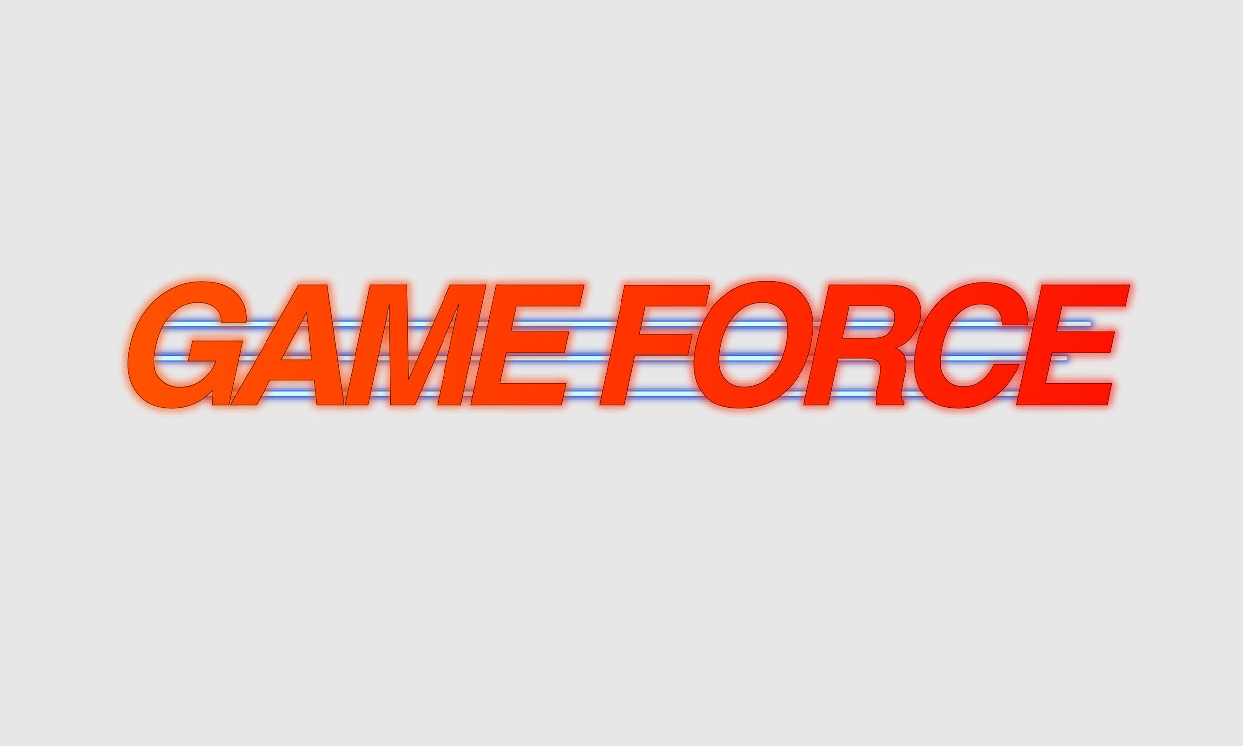
I wanted to make the site easier to look at and navigate through. Organization was a big concept I had in mind as I was putting this site together because the old site was a jumbled wall of text. I also hand-designed the logo you see on the redesigned website. I meticulously looked through all my available typefaces to find the closest match to their sign outside, adjusted the kerning and italics to be as close to the sign as possible, and then added those blue neon bars that sit behind the “Game Force” text. It’s subtle, but I made the whole logo glow as if it is the digital version of the big bright neon sign they have above their doors.
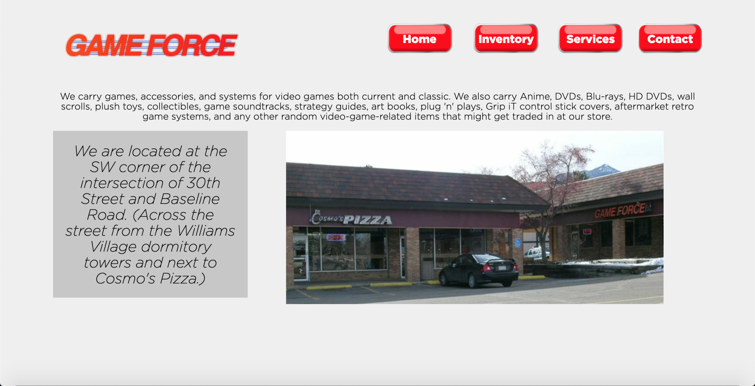
Home Page
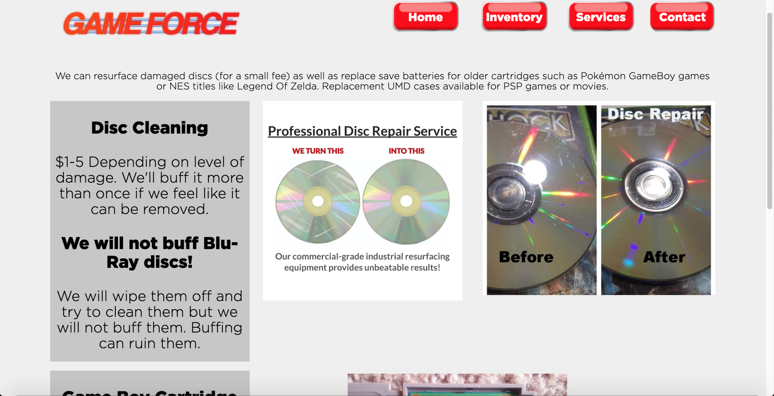
Services Page
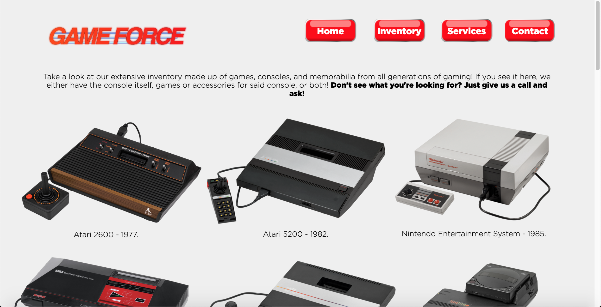
Inventory Page
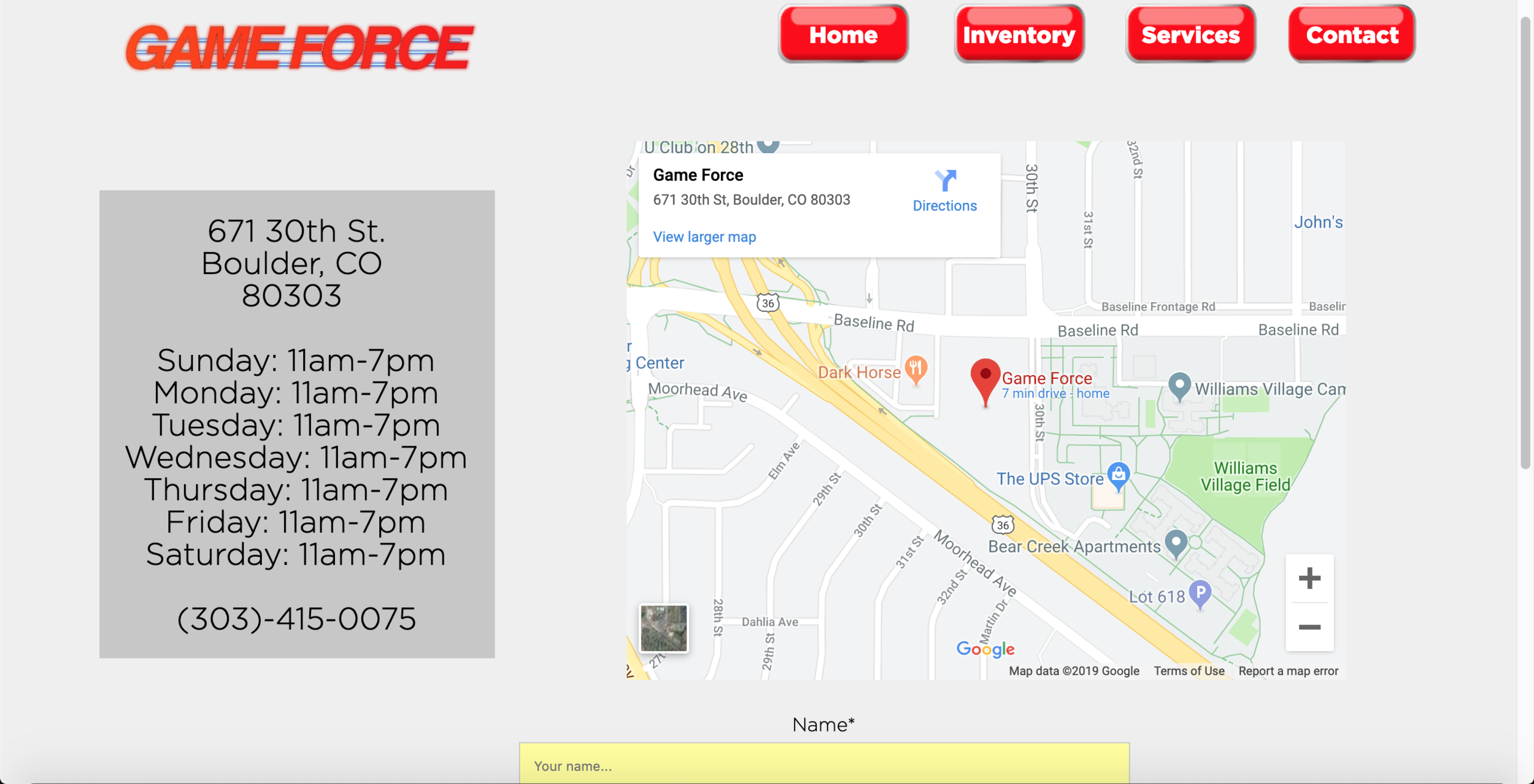
Contact Page